2020 0012 0027
After the 100th time checking the weather or looking up transit times before heading out the door in the morning, I came to the realization that having a tablet mounted near my front door with relevant information would be useful. In anticipation of venturing outdoors more regularly in a post-vaccine world, I decided to build a personal dashboard as my pandemic project.
There is a good deal of prior art in this space, from the Magic Mirror Raspberry-Pi-deployed dashboard intended to be embedded in a DIY mirror, to customizable iPad apps that have all the common personal dashboard features out-of-the-box. For my part, I wanted to balance the customizability of a DIY project with the lightweight-ness of a solution that runs entirely on a tablet. I specifically wanted to customize the particular APIs used, including some less common sources like local transit times. Though I make no claims to being a frontend developer, I expect it is uncontroversial to say that a backend-less SPA is among the more lightweight options in the web application space. And my go-to for building frontend applications is ClojureScript.
This series of posts will walk through the creation of cockpit, the ClojureScript SPA I now have mounted on my wall. Before getting to specifics, let’s look at the final dashboard:
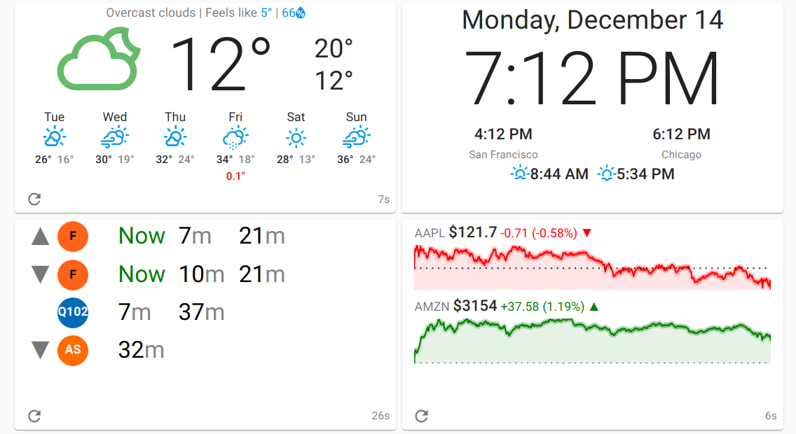
Some highlights:
-
The dashboard is divided into “Cards” using a responsive grid layout with primitives from Material-UI.
-
Data for each card is polled at a regular interval with a timer in the bottom of each card showing the time elapsed since the data was last fetched and a “refresh” button to fetch the data right away.
-
The weather card is sourced from the Open Weather Map API with icon styling provided by the Weather Icons font. It includes typical low/high, forecast, and precipitation information.
-
The clock card is self-explanatory–the time is obtained from a plain Javascript
Date()call which returns the system date/time in the local timezone. -
Stock data is pulled from the IEX Cloud API and styled with react-sparklines.
-
The transit card contains rows with arrival times at a transit stop (arrows indicating cardinal direction at the stop). The data source here is an Open Trip Planner instance loaded with the GTFS feeds from the particular transit agency in question.
-
The compiled dashboard is physically hosted from my home router and is displayed on an inexpensive Amazon Fire 8 tablet with the Fully Kiosk app.
There are loads more details that go into a card–each is effectively its own mini application. This post will primarily cover the skeleton of the dashboard and the bare-bones clock card; I’ll aspirationally follow-up with future posts to explore the other cards in the dashboard.
Dashboard Skeleton
In the ClojureScript SPA space, there are several stand-out React wrappers vying for dominance. For this project, I chose re-frame since the learning curve for a small-scale project was lighter than Fulcro. Rather than wire all the various libraries, build tools, and debugging utilities together manually, the re-frame-template makes it easy to get started. This
lein new re-frame cockpit +10x +cider +kondo +test
is basically how I seeded the repo. The biggest opinion imposed in the template aside from re-frame itself is shadow-cljs as the build tool.
With a skeleton project in hand, let’s wire up the views. Dipping our
toes into Material UI requires adding it as a dependency to
src/cljs/deps.edn:
{:npm-deps {"@material-ui/core"  "4.9.13"
            "@material-ui/icons" "4.9.1"}
 ...}
which will instruct shadow-cljs to fetch the dependencies through
npm during the build.
The src/cljs/<project>/views.cljs file is where the “Hello World”
main-panel lives. Thanks to the magic of shadow-cljs, we can
require the React components directly into the cockpit.views
namespace as if they were native ClojureScript code:
(ns cockpit.views
  (:require
   [re-frame.core :as re-frame]
   ["@material-ui/core/Card"        :default Card]
   ["@material-ui/core/CardContent" :default CardContent]
   ["@material-ui/core/Container"   :default Container]
   ["@material-ui/core/Grid"        :default Grid]
   ["@material-ui/core/CssBaseline" :default CssBaseline]
   ["@material-ui/core/Typography"  :default Typography]))
With this in place, we can modify the main-panel with our Material
UI Grid components:
(defn main-panel []
  (let [card-opts {:item true :xs 12 :sm 12 :md 6  :lg 4}]
    [:> CssBaseline
     [:> Container {:maxWidth false}
      [:> Grid {:container true :spacing 1}
       [:> Grid card-opts [weather]]
       [:> Grid card-opts [clock]]
       [:> Grid card-opts [transit]]
       [:> Grid card-opts [stocks]]]]]))
The :> shorthand adapts React components into Reagent
components. weather, clock, transit, and stocks are functions
that define the contents of each card. This gives us a blank slate to
fill in our cards with content.
Clock Card
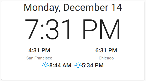
The clock card consists of a header with the date, the current local time, a side-by-side view of the time in the US Central and Pacific time zones, and the sunrise/sunset times.
The clock view implementing this looks something like:
(defn clock []
  [:> Card
   [:> CardContent

    [:> Typography {:align "center" :variant "h4"}
     @(re-frame/subscribe [::events/day])]

    [:> Typography {:align "center" :variant "h1"}
     @(re-frame/subscribe [::events/time])]

    [:> Grid {:container true :spacing 0 :direction "row"
              :justify "center" :alignItems "center"}
     [:> Grid {:item true :xs 6}
      [:> Typography {:align "center" :variant "h6"}
       @(re-frame/subscribe [::events/time-pt])]
      [:> Typography {:align "center" :variant "body2"}
       "San Francisco"]]
     [:> Grid {:item true :xs 6}
      [:> Typography {:align "center" :variant "h6"}
       @(re-frame/subscribe [::events/time-ct])]
      [:> Typography {:align "center" :variant "body2"}
       "Chicago"]]]

    (let [{:keys [sunrise sunset]}
          @(re-frame/subscribe [::events/sun])]
      [:> Typography {:align "center"
                      :variant "h6"}
       [:i {:class "wi wi-sunrise"}]
       sunrise
       [:i {:class "wi wi-sunset"}]
       sunset])]])
which makes liberal use of the Typography Material-UI component
along with a nested Grid component to show the ET/CT timezones
side-by-side. The only missing pieces are some minor styling to fix
the height of the Card so it fills the containing Grid.
Nested within the React components that make up the clock view are
re-frame/subscribe functions which bind the view to re-frame
subscriptions which are, effectively, listeners for re-frame
events. Subscriptions and events are commonly defined in
src/cljs/<project>/events.cljs. The clock events and subscriptions
for the main time display are comparatively simple:
(re-frame/reg-event-db
 ::timer
 (fn [db _]
   (assoc db :clock (js/Date.))))

(re-frame/reg-sub
 ::clock
 (fn [db _]
   (:clock db)))

(re-frame/reg-sub
 ::time
 :<- [::clock]
 (fn [clock _]
   (.toLocaleTimeString
    clock
    []
    (clj->js {:hour "numeric" :minute "numeric" :hour12 true}))))
Subscriptions and events in re-frame are a complex
topic, so this treatment will only begin to scratch the surface. In
short, the ::timer event–when triggered–will update the :clock
key in the application’s db state hash-map. The ::clock
subscription defined with reg-sub is a “Layer 2” extractor
subscription that does nothing but pluck the :clock key back out of
the application db. The ::time subscription is a “Layer 3”
materialized view of this extracted value (the :<- [::clock] adds
the subscription dependency), converting it to a string that is ready
to be inserted into the rendered view. Internally, re-frame chains
these subscriptions into a graph, updating all the Layer 2
subscriptions when the db changes, and then updates only the changed
Layer 3 subscriptions and their subscribed views, leaving everything
else untouched.
The remaining subscriptions are left as an exercise to the reader with
spoilers available (isolated to a dedicated namespace) in the
clock.cljs file in the source.
To tie things together, we must continually trigger the ::timer
event for our clock to receive updates and subsequently be re-rendered
in the view. For this, we turn to re-pollsive, a library that lets
us trigger events based on a fixed time interval. After adding the
library dependency to the project.clj file, we initialize it in the
src/cljs/<project>/core.cljs file to continually send the ::timer
event:
(defn init []
  ...
  (re-frame/dispatch [::poll/set-rules
                      [{:interval                 1
                        :event                    [::events/timer]
                        :dispatch-event-on-start? true}]])
  ...)
An :interval of 1 will update our clock every second.
With all this in place, a lein dev will build and begin serving the
application from localhost:8280, complete
with hot-reloading to make iterating and tweaking the app seamless.
The next post in this series will dive into the Weather card, which involves our first external API calls.
| Part 1 | Part 2 | Part 3 |